A quick summary of what we just experienced in the month of march.
High volatility driven by lack of confidence in the banking system and some good and bad news around the crypto industry like airdrops, de-pegs, launches, SEC fighting cryptocurrencies, etc. Good month for liquidity providers in terms of fees generated.
As a consequence, volume and fees spiked putting higher highs month over month slowly recovering of the debacle of last year and the ripple effect it caused.
Volumen & Fees respectively. DefiLlama and TokenTerminal.
BNB saw the most active addresses of all with +12M distinct addresses that executed a transaction in the period of 1 month, followed by Ethereum (+5M) and Polygon (+2M)
Ronin was the chain that experienced the best positive change in percentage terms of active addresses with an upside of 276%, climbing to the 6th spot of Active addresses.
In terms of number of transactions, again, BNB saw the most activity of all with +109M transactions in a month. Nº2 goes to Polygon (+87M) and Nº3 was Ethereum (+31M)
Multichain Activity. Nansen
Fees
The Top 10 that drives the most fees, 4/10 are blockchains (Ethereum, Tron, BNB and Bitcoin) and 6/10 are dApps (Uniswap, Lido, GMX, Convex, dYdX and Blur). After these data we can think about the certainty of the fat protocols theory, but digging deeper we can also see that ~63% of the fees generated by the Top 10 come from blockchains themselves ($288M).
Most fees generated by protocols. TokenTerminal
Trending Contracts.
In terms of gas used by a contract we can see the following:
In Ethereum, 2 out of the Top 5 are AMM contracts, in this case Uniswap Router contracts. Also 2 out of the Top5 are NFTs marketplace contracts corresponding to Blur.io and Opensea respectively. The one left is Tether’s USDT contract using a whopping of $8.5M in gas and being the contract in all the ecosystem with the most Transaction count (3.16M) and Active users (+941M).
In Polygon things change. One thing that has caught my attention is that just 16 addresses used +$132k in gas corresponding to Lens Protocol: Proxy Action (something to bear in mind.)
In BNB has a similar landscape to Ethereum. Within the Top 5 we can see an AMM in the fist spot (PancakeSwap) and also Tether’s USDT in second place. The rest belongs to dApps or unlabeled protocols.
Top 5 contracts by chain. TokenTerminal
The Main Topic.
When things get messy and scary, where are people going? Hard protocols are the answer and that’s exactly what we are going to cover in this point.
When I talk about “hard protocols“ I’m referring to those that drive almost all the volume when there’s something big happening in the industry. But why and what are those protocols? Let’s find out:
Where do people actually trade? (Volume generated)
Who is benefiting the most out if this? (Fees capture → Protocol and Supply-side)
The first question have some clear winners.
Source: DefiLlama
In terms of % dominance Uniswap V3 got more than half of all the trading volume that happened over the month with 50.28% of share. Followed by Curve that saw one of its best month in terms of dominance with 15.94%. Pancake is consolidating the third spot with 4.53%, a place that is not new for this protocol who enjoys the most activity and trading volume in the BNB chain.
Excluding derivatives protocols with the following volumes.
Source: TokenTerminal
This brings us to the next aspect: capital efficiency.
To answer this question I will rely on the volume/TVL ratio which can be used (it is not a certain science) to measure the capital efficiency of an AMM or DEX. The higher the number, the better efficiency of the protocol.
"Trading volume/TVL" ratio can be a useful metric, but it is important to use it in conjunction with other metrics and consider the overall market context and the specific platform to have a complete picture of capital efficiency in DeFi.
According to DefiLlama:
Uniswap: 0.27 ($8.78B (volume) /$3.96B (TVL) )
Curve: 0.03 ($496M (volume) /$4.72B (TVL) )
PancakeSwap: 0.07 ($149M (volume) /$1.2B (TVL) )
Looking at this data one could say, since the majority of Uniswap's volume comes from its version 3 (concentrated liquidity), that a better technology shows better capital utilization. But as I have highlighted above, this metric should be sustainable over time to be able to draw conclusions, as it may be due to specific moments in time.
This is interesting as both Curve and Pancake incentivize (each in a different way) the use of their protocol while sharing the profits made by the protocol. Does all this matter in times of turbulence? In my view Curve's model is the fits successfully for times of high volatility, making it attractive to be a $CRV staker as in the last 30 days the earned 50% of all fees generated which was roughly $2M.
Continuing with the topic of volatility but changing markets, we highlight the good performance of the derivatives protocols. I have previously touched with a brief image the volume generated by some of these protocols, clearly amplified by the use of leverage, but which shows the importance and the momentum that this type of financial instruments, in their decentralized form, can have in periods of volatility to hedge against it or simply to benefit from it in a broader way (going long or short.). Another good financial instrument for the same purposes could be options, a market that could experiment good traction in the near future with the advancements in the performance of blockchains and the decrease of gas by layers 2.
Daily trading volume for dYdX, GMX, Gains Network, Deri Protocol, SynFutures in the past 30 days.
Finally let's see what the financial data tell us this month. For this I am going to rely on one of the new features of TokenTerminal, its Financial statements section.
The protocols and ecosystem we are going to address, for reasons of length and momentum, are going to be:
1. the Arbitrum ecosystem in general, and
2. Stablecoin issuers.
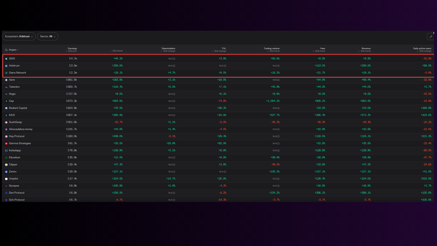
Arbitrum Ecosystem:
As for the profits obtained by the protocols we see that those that exceed $1M are Arbitrum itself, which obtains its income by charging commissions for posting the activity that occurs on this layer to Ethereum (Revenue= Fees - Token incentives). In this case Arbitrum has made a profit of $3M, only surpassed by GMX ($4.7M) which has maintained its position on the throne but has seen a decrease in its active users compared to February of -42%. However, its trading volume has managed to increase by 60%, which may indicate that the most professional and capital intensive users have remained, with a high user retention rate for this protocol (~80%). In third position is a competitor of GMX, namely Gains Network. All its metrics have increased (except active users with a decrease of -6%), and it has achieved a revenue of $2.3M, it should be noted that this protocol does not spend money on incentives, making its business model more sustainable.
Stablecoin Issuers:
Despite the momentary storm (hopefully) experienced by the loss of the peg suffered by Circle's $USDC, there are always winners in this kind of periods. In this case Liquity and Maker protocols (despite $DAI losing its peg) are clear winners. Let's take a look at the data:
Liquity has seen its income statement skyrocket, with fee increases of +780% from $85K in the previous month to ~$750k which has gone entirely to the $LQTY holders, however incentives have also been highly increased by +220% or the equivalent of $1.22M, making a net (income-incentives) of -$475K. This is a clear example of how incentives, despite generating revenue, can lose you money, but that does not mean that they are not doing their job, it is simply a matter of gauging when to allocate certain amount of incentives. As for the multiples, they have all been negatively affected, which could be due to the high expansion of fees and revenue.
On the other hand, we have Maker, which saw its stable coin losing peg as Circle's did. In spite of this, everything has returned to normal, leaving a very attractive revenue, earning $2.23M in interest paid by borrowers to $MKR holders. In the case of Maker and unlike Liquity, its incentives do not exceed $250k, making a profit of ~$2M, not bad for having gone through a small crisis. The price of $MKR has seen slight rises of 6% but with a trading volume that has been close to $3B or a +208% increase compared to last month. In this case its multiples valuation has dropped to attractive levels as can be seen in the statement. Maker is becoming more and more resilient.
And that’s a wrap, I hope you enjoy and learn something in my very first post in Substack. If you like this way of presenting data or you have some other ideas don’t hesitate on communicating it! Give me a follow if you want to stay up to date in Web3 and DeFi analytics.


Congrats for your thorough approach.